

On this page
UX/UI
Taniti Tourism Website (HJP1)
A research-led website mockup for a fictional island destination, developed from persona and information architecture through a nine-screen InVision prototype and remote usability testing.
Source photography and iconography by various contributors documented in the original project citations
Taniti is a fictional tropical island used as the brief for a Western Governors University user-experience project. The assignment was to design the tourism site, not build it, so there is no code repository. The work lives in the research, structure, wireframes and interactive mockup.
Starting with the trip, not the homepage
The project began with a traveler persona and a content inventory. The persona favored hotels, local food, beaches, sightseeing and occasional outdoor activities, while still needing practical answers about transport, safety and holiday closures. That made the site’s job larger than selling scenery: it had to support discovery, planning and booking without hiding basic travel facts.
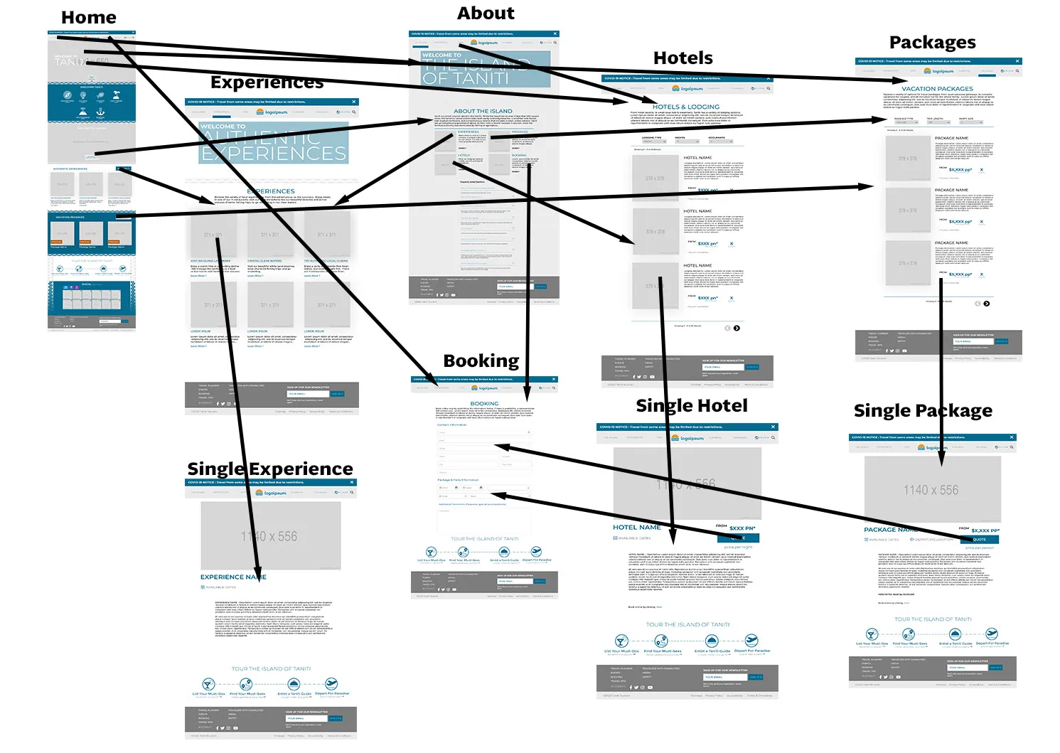
I turned that into a sitemap with five main paths - the island, experiences, hotels, planning and packages - and detail pages that converge on booking. A separate flow diagram checked that the calls to action across the screens actually led somewhere useful.
Building the prototype
The visual system uses ocean blue, a small warm-orange accent and large, high-contrast interaction targets. Destination photography does the emotional work while the page structure stays task-oriented: explore the island, compare an experience or place to stay, then move toward a quote or booking request.
Nine desktop screens were assembled into an InVision prototype: home, island overview, experiences, experience detail, lodging, lodging detail, packages, package detail and booking. Supporting trip-planning content and a repeated four-step journey strip keep the visitor oriented between those routes.
Testing changed the labels
Because this was completed in 2020, testing was remote. Four participants worked through a structured Google Forms survey against the prototype. The small sample was enough to expose a specific information-architecture problem: attractions and booking were easy to find, but half of the participants could not identify where lodging lived.
The original header used the short label “Stay.” Feedback described it as vague and asked for wording closer to “book your stay,” so the final navigation names the destination directly as Hotels. Testing also showed that the booking deadline on a package detail page was technically present but visually easy to miss; the revision promotes it next to availability instead of leaving it in the body copy.
What this artifact is - and is not
This is a high-fidelity design prototype, not a production travel site. Some detail screens intentionally retain placeholder imagery and copy, and an early mobile exploration was removed after the assignment requirements were clarified. The source photography, icons and placeholder services are recorded in the original project citations; the interface design, information architecture, prototype and testing work are mine.
Prototype and planning artifacts
The final homepage brings trip planning, experiences, packages and booking paths into one destination overview.
The island overview combines destination context with an FAQ for practical travel questions.
A card-based experiences index separates discovery from the detail and booking tasks that follow.
The lodging path was made explicit after testing showed that the original wording was too easy to miss.
Packages can be narrowed by type, trip length and party size before opening a detail page.
The booking screen carries the same navigation and trip-planning cues into a focused form.
The sitemap established the hierarchy and the routes into the shared booking task before visual design began.